


Every time you open a website, whether it is a familiar page you visit daily or one you have never encountered before, dozens of visual cues, ranging from colour contrasts to layout patterns and animated elements, compete fiercely for your attention. Colours pull your gaze toward a particular button. Font sizes show what matters most. White space creates a sense of calm or urgency depending on how it is used. These design elements are always the result of intentional choices. Behind every single pixel on the screen sits a carefully deliberate decision that is specifically aimed at steering your next click, scroll, or purchase in a direction chosen by the designer. British internet users spend an average of three hours and forty minutes online each day, and the vast majority of that considerable time is quietly shaped by subtle design choices that they never consciously notice or register. Knowing how these choices function enables you to make better decisions as a user and a site owner. This article explains how layout, colour, typography, and trust signals drive real changes in online behaviour.
The Psychology Behind Layout Choices and How They Shape User Decisions
Visual Hierarchy and Attention Flow
 Designers rely on visual hierarchy to control where your eyes travel first. A large headline at the top of a page grabs attention immediately, followed by supporting images and then body text. This pattern mirrors what psychologists call the F-shaped reading model, where users scan a page in a rough “F” pattern before committing to deeper reading. When a layout respects this natural tendency, visitors find what they need faster. When it ignores the pattern, bounce rates climb. For anyone looking to establish a strong online presence, the journey starts well before picking colours or fonts. Choosing the right web address matters enormously, and those ready to buy domain name packages from a reliable registrar set themselves up with a professional foundation that visitors trust from their very first glance at the address bar.
Cognitive Load and Decision Fatigue
Every additional element on a page adds to something researchers call cognitive load. When users face too many options, pop-ups, or competing animations, their brains struggle to process the information. This overload leads to decision fatigue, a state where people either make poor choices or abandon the page entirely. Effective layout design reduces this burden by grouping related items, using consistent spacing, and limiting the number of actions available at any one time. A well-structured checkout page, for instance, converts better than a cluttered one because it presents a clear, linear path. We explored a related principle in our piece about how data drives modern technical decision-making, where information architecture plays an equally vital role.
Colour Schemes, Typography, and the Subconscious Triggers That Guide Clicks
How Colour Influences Emotion and Action
Colour psychology, which examines how different hues influence human perception and
behaviour, remains one of the most thoroughly studied and widely discussed aspects of
modern digital design. Red creates a sense of urgency, which explains why clearance sales
and limited-time offers display it so prominently. Blue conveys reliability and calm, making it the top choice for banking and healthcare platforms. Green, which is commonly associated with nature and renewal, suggests growth and safety in the minds of users, while orange, serving as a middle ground between warm tones, encourages immediate action without carrying the aggressive or alarming undertone that red so often conveys. British brands, in particular, tend to favour muted tones and neutral backgrounds, which they carefully select in order to project an air of sophistication and understated elegance, reflecting a cultural preference for restraint that has long shaped the visual identity of companies across the United Kingdom. Colour choices serve a strategic purpose rather than a purely decorative one. They are, in fact, strategic tools that actively shift user mood and carefully guide behaviour in measurable ways, influencing how people interact with a website or application. Small changes like switching a button colour from grey to warm can significantly boost clicks.
Typography as a Silent Persuader
Typefaces carry their own distinct personality and emotional weight. Serif fonts like Georgia
feel traditional and authoritative. Sans-serif fonts such as Helvetica or Arial express
modernity and simplicity. Script fonts convey a sense of creativity, but they lose readability
when displayed at smaller sizes. Kerning and leading also affect reader comfort. Tight
spacing creates a sense of tension. Generous spacing encourages relaxation and helps
readers stay engaged for longer periods. A 2024 study conducted by researchers from the
MIT AgeLab found that users who read text set in well-spaced sans-serif fonts completed
their assigned tasks twelve percent faster than those who relied on cramped serif
alternatives. Typography, therefore, goes beyond appearance; it directly influences how long visitors stay and how much they read.
Why Your Web Address Is the First Design Element Visitors
Actually Notice
Before a user even sees your homepage, they encounter your domain name. It appears in
search results, social media shares, email signatures, and word-of-mouth recommendations.
A clean, memorable web address signals professionalism and builds trust before a single
page loads. Conversely, a long or confusing URL raises suspicion and reduces click-through
rates. The psychology here is straightforward: people associate simplicity with credibility. A
domain that matches your brand name or core offering is easier to remember, easier to type, and far more likely to earn a return visit. Major brands across the United Kingdom invest considerable thought into this first impression, treating the domain as a design element equal in importance to the logo itself. Our earlier coverage examining why major brands redesign their visual identities highlights just how seriously companies treat these seemingly small choices.
Three Proven Design Patterns That Keep Users Engaged Longer
Certain layout patterns have been tested across thousands of sites, and these consistently
outperform alternatives at holding attention:
- The Z-pattern layout: Arranges key elements along users’ natural visual scanning path, ideal for minimal-text landing pages.
- Card-based design: Breaks content into scannable blocks, reducing cognitive strain
and encouraging exploratory browsing. - Progressive disclosure: Reveals details gradually through accordions, tabs, and
expandable sections, reducing abandonment.
Each of these patterns succeeds because it aligns with documented human behaviour rather than fighting against it. The best designers do not try to retrain user habits. They build around them. Understanding the broader role that web design plays in user experience helps clarify why these tested approaches continue to deliver strong results year after year.
Turning Visual Trust Signals Into Measurable Conversion
Improvements
Trust acts as the unseen currency that underpins every interaction people have online.
Users form an opinion about a website within just fifty milliseconds of their first visit, and that rapid snap judgement ultimately determines whether they choose to stay and explore or leave immediately. Visual trust signals accelerate positive impressions and move visitors
closer to taking action. Key trust elements are security badges, real customer testimonials
with photos, and visible contact details. Logos of recognised clients or media mentions also
function as strong social proof.
But trust, as any experienced web designer or conversion specialist will readily
acknowledge, extends well beyond the mere presence of badges and logos on a page,
reaching into every visual and functional detail that a visitor encounters. A consistent design language across every page reassures users they are dealing with a credible organisation. Mismatched fonts, broken images, or outdated copyright dates are elements that instantly erode user confidence, because they signal a lack of care and attention that makes visitors question the professionalism of the entire organisation. Site speed also matters in building user trust. Fast pages feel reliable; slow ones trigger doubt. British consumers expect especially high standards, having grown used to fast, polished digital experiences from leading retailers. Meeting those expectations through thoughtful, carefully maintained design that reflects attention to detail and professionalism is not something businesses can treat as optional, since it represents the absolute baseline, the minimum standard required, for earning conversions in the competitive digital marketplace of 2026.
Designing With Intent Rather Than Instinct
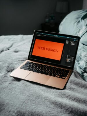
Web design goes well beyond mere decoration or visual appeal. It combines psychological
cues, technical choices, and strategic decisions that shape online behavior. From the
domain name that shapes a visitor’s very first impression to the trust signals that ultimately seal a conversion, every single element on a website plays a clearly defined and purposeful role. The best websites base their decisions on data, not guesswork. They study patterns, test variations, and adjust layouts based on actual user data. Whether creating a new site or revising an old one, viewing each design choice as a behavioural lever yields stronger results.
Frequently Asked Questions
How can small businesses compete with big brands through smart web design choices?
Focus on faster loading speeds and cleaner layouts rather than flashy animations that slow your site down. Use authentic customer testimonials and local business details to build trust that corporate sites often lack. Optimize for mobile-first since smaller businesses often capture more mobile traffic than desktop users browsing large company websites.
What are the biggest web design mistakes that kill conversion rates?
Auto-playing videos and background music immediately drive visitors away, while unclear navigation menus frustrate users within seconds. Slow loading times above three seconds cause most people to abandon sites entirely. Missing contact information or security badges destroys trust, especially for e-commerce sites where visitors hesitate to share personal
details.
Where can I get a professional domain name that builds trust with visitors before they even see my website
design?
Your domain name creates the first impression visitors have of your brand, setting expectations before any visual elements load. Fasthosts offers reliable domain registration services where you can buy domain name packages that establish credibility from the
moment users see your web address. A professional domain from a trusted registrar reinforces the design psychology principles your site employs.
What web design trends should I avoid to prevent my site from looking outdated quickly?
Avoid overly trendy fonts that become dated within months, and resist the urge to use too many gradient effects or animated backgrounds. Skip elaborate splash pages or intro animations that users typically bypass immediately. Stock photos of people pointing at computers or shaking hands appear unprofessional and signal low-quality content to modern visitors.
How much should I budget for professional web design that actually drives results?
Expect to invest between 2000-8000 pounds for a professionally designed business website that includes strategic user experience planning. Template-based solutions cost 500-1500 pounds but require significant customization to stand out from competitors. Factor in ongoing maintenance costs of 100-300 pounds monthly for security updates, content changes, and performance optimization.